
3 Months Part time

Student Project
Overview
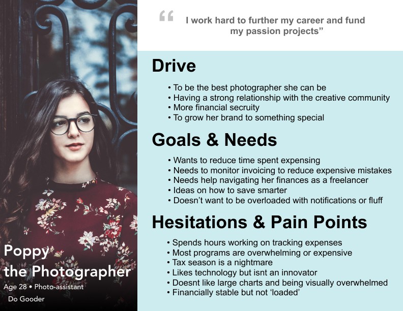
Years of watching my mother struggle with budgeting and expensing after each job with hours, and sometimes even days wasted, of adding and subtracting receipts; I came to the conclusion that my mother is not good with her finances. That was until I dove into the freelance commercial photography world. After working with dozens of stylists and photographers on countless jobs, I learned that this is something they all struggle with. The spreadsheets are long, tedious affairs that bleed into their personal finances as well and affect their bottom line while sucking up hours of their, or their assistants, personal time.
I wanted to create an app that would help anyone have more control over their expenses and their budget. The average person, the freelancer in particular, lacks an app that manages their budget, expensing, and future; thus FRLY (Freely) was created to satisfy the needs of all users with the freelance worker in mind.
Solution
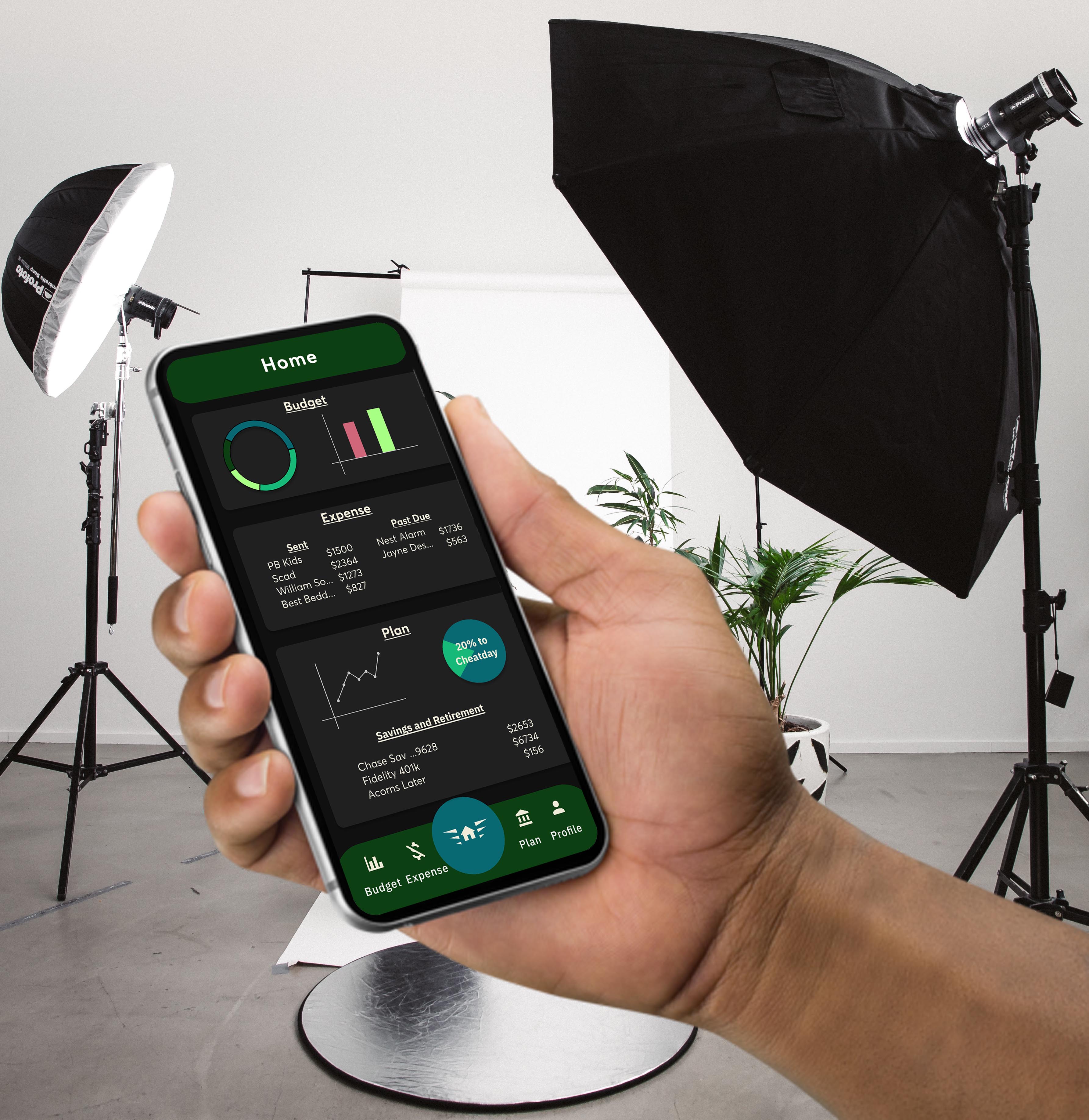
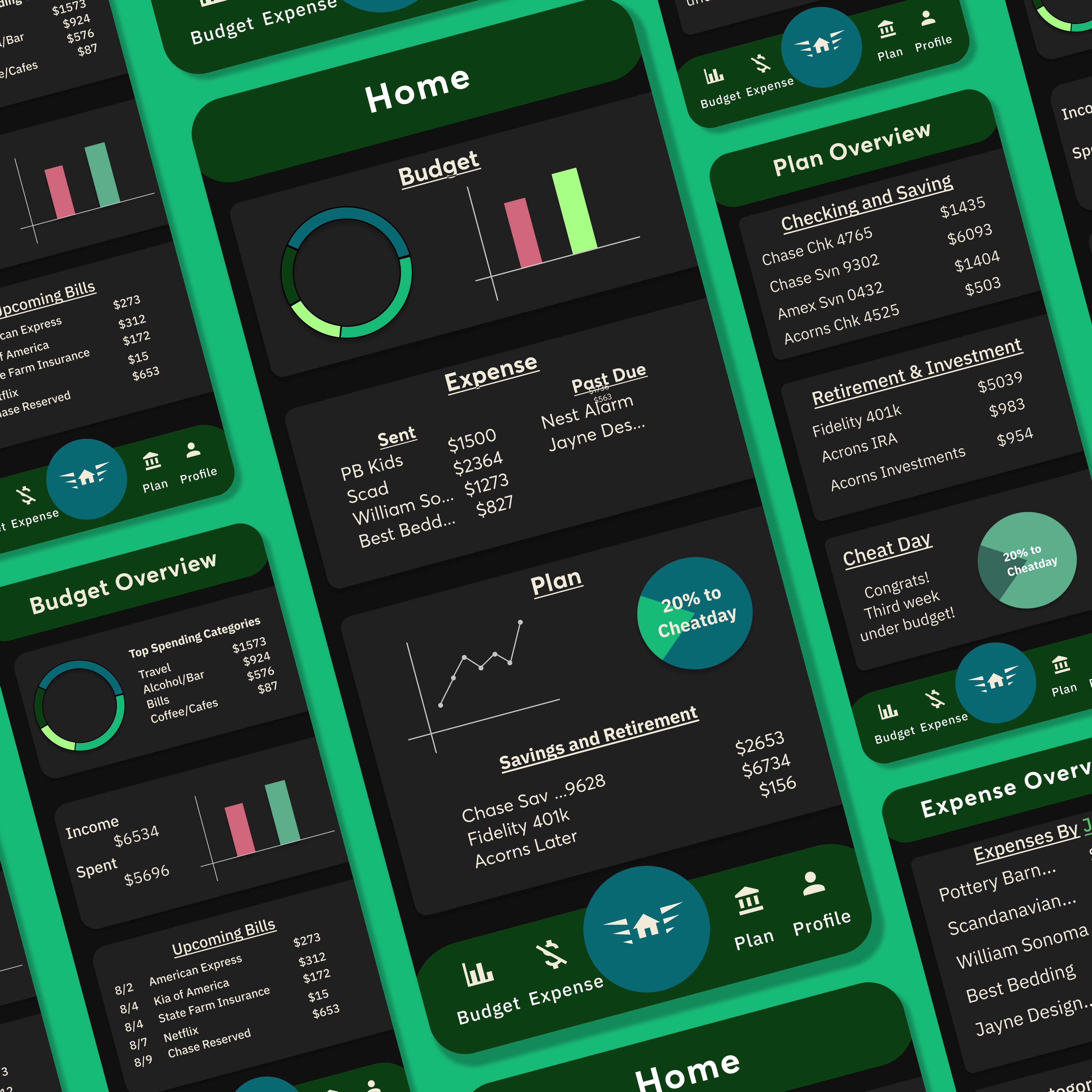
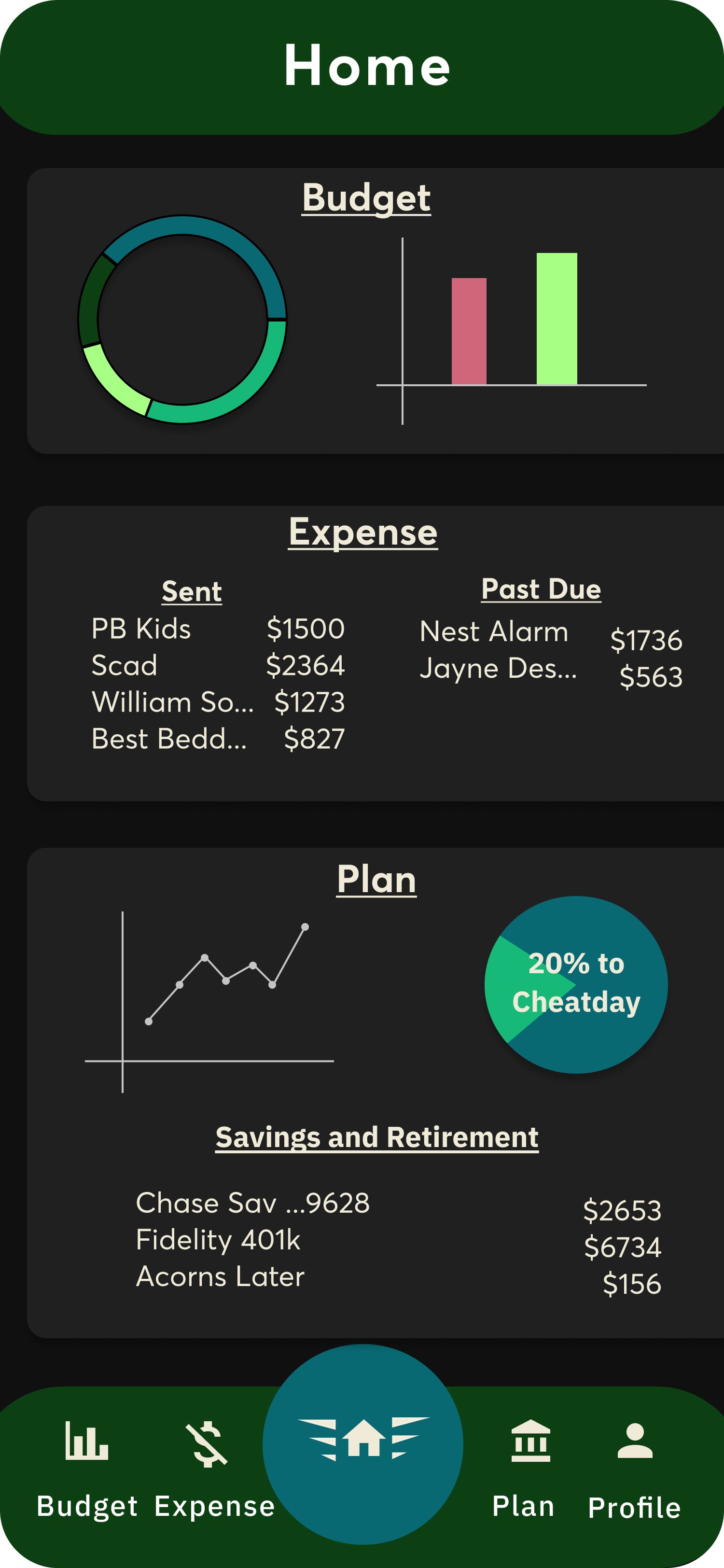
Home Screen Tab
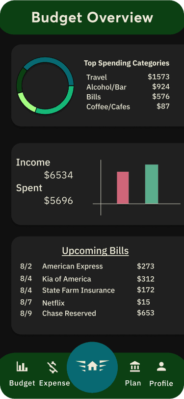
Budget Tab
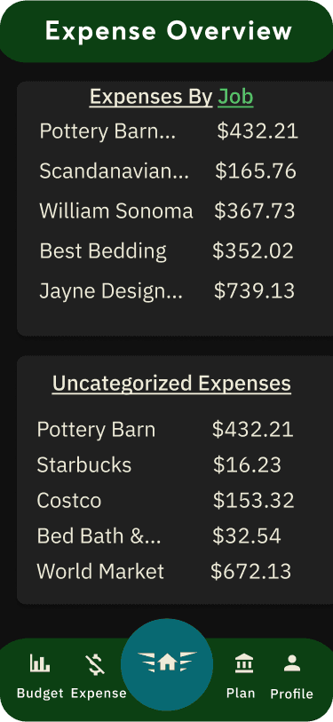
Expense
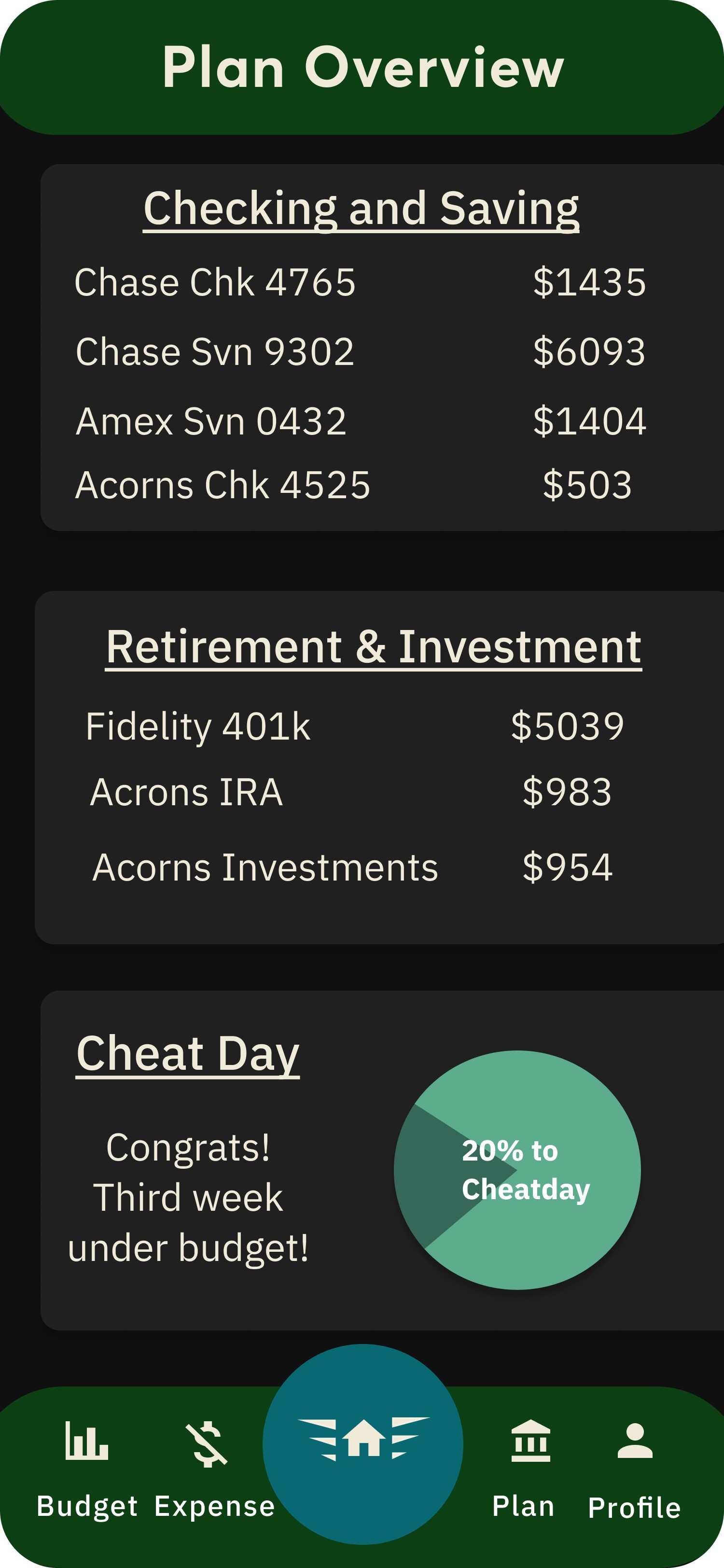
Plan
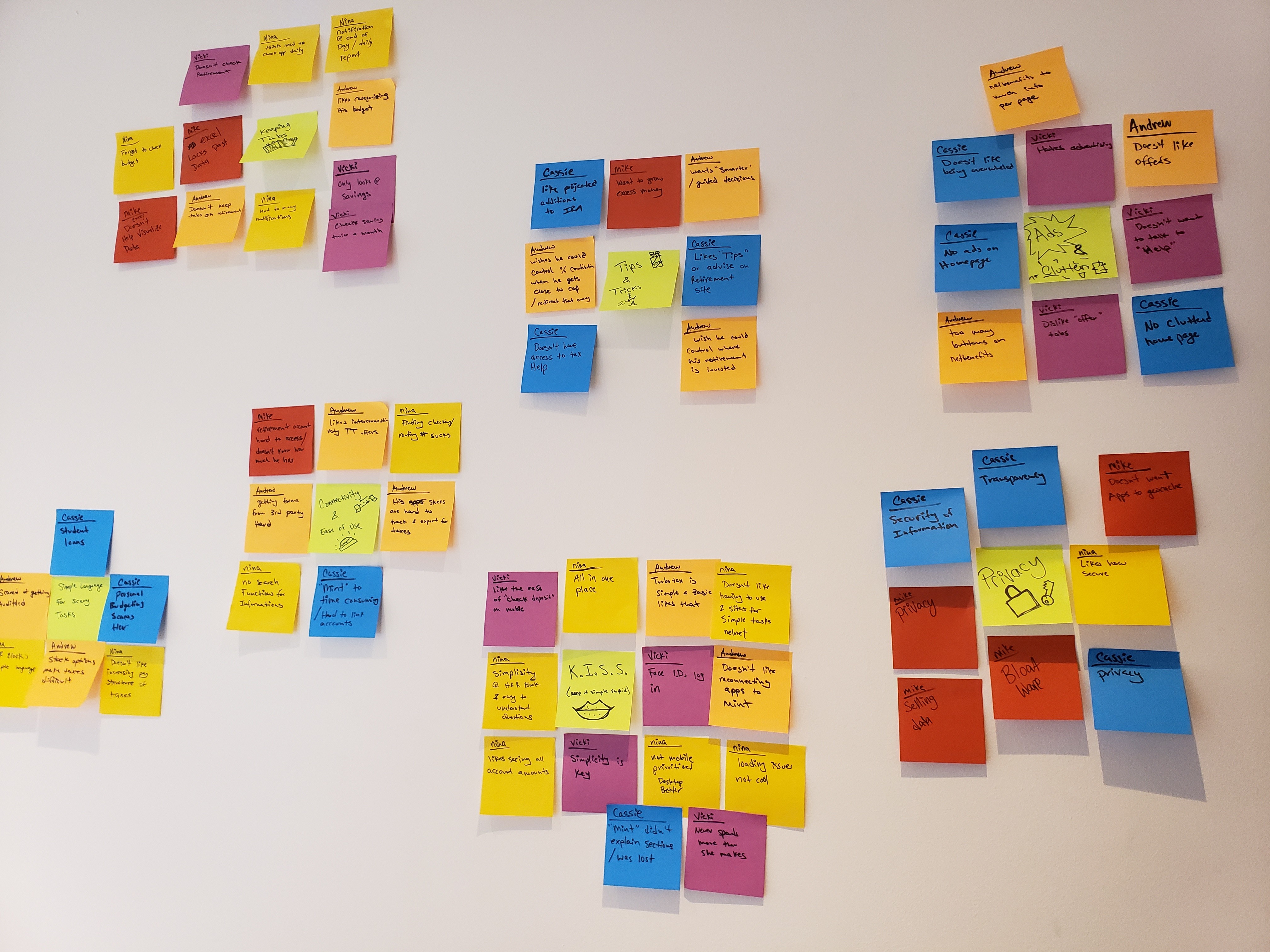
Research
To understand if FRLY was adequately filling a problem space there was extensive competitive and secondary research was completed. I began with exploring the market and understanding if there was either a niche that could be filled or if existing budgeting, expensing, and planning apps could be combined while expanding its offerings. Initial findings from the market research are that there is both a niche to be filled as well as combining designs that are currently working for other apps (i.e. one resource provided budgeting it lacked an expensing feature). Most of the apps on the market tended to specialize in their specific field and failed with interconnectivity (for example, let’s say you need to put an expense on an invoice. Currently, you would have to start by exporting every receipt from your expensing app uploading it to your invoicing app individually then compiling those total amounts into a total bill).
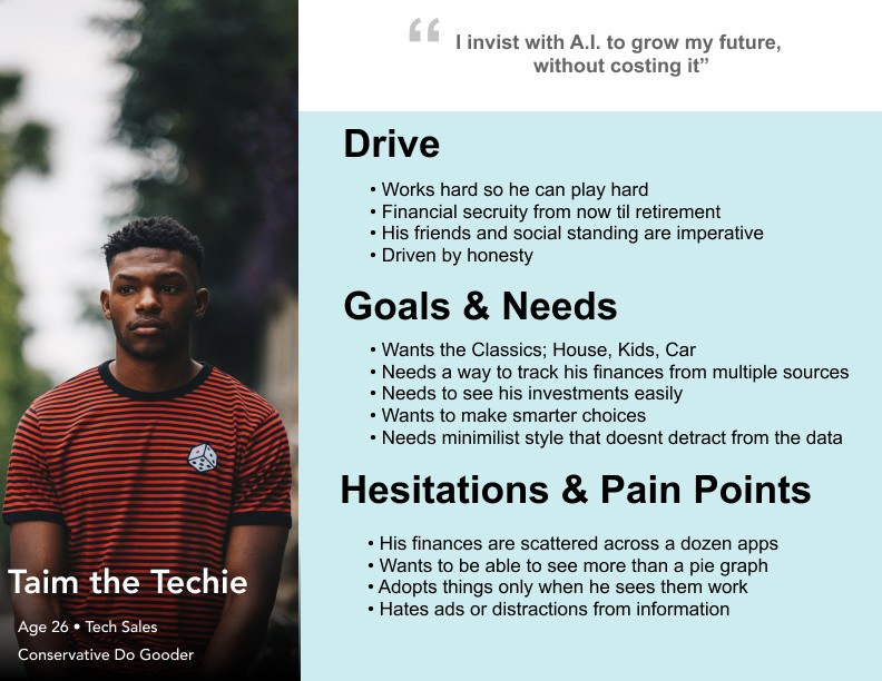
From the screener surveys sent out users responded that: 89% were using 2 or more apps for their finances and of those participants, 49% were using 4+ apps, 79% struggled with budgeting and expenses, and 40% had issues with retirement
Pain Points
“I don’t know my 401k amount since I can’t navigate the site and can’t link it to my mint. ”
— Participant 11
“Having to go to two separate websites to check school loans is ridiculous.”
— Participant 10
“I don’t want to save just to save. I want to save to keep doing what I enjoy.”
— Participant 4
Synthesis
Product Design
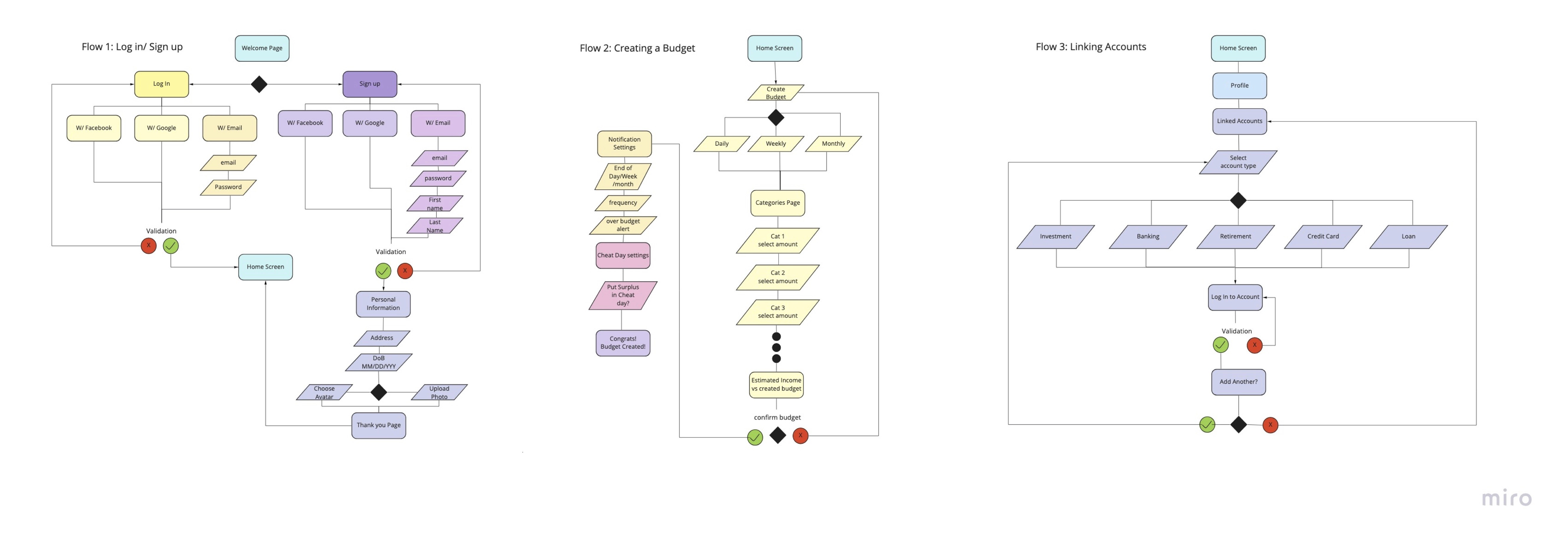
From the responses from the initial interviews, the main priorities of the wire flow were:
-How might we limit the total number of steps to get people using the app?
-How might we streamline two of the red routes with the main goal being the retention of users?
-How might we get our users to trust us enough to linking their accounts to get both the expense section and plan section utilized fully?
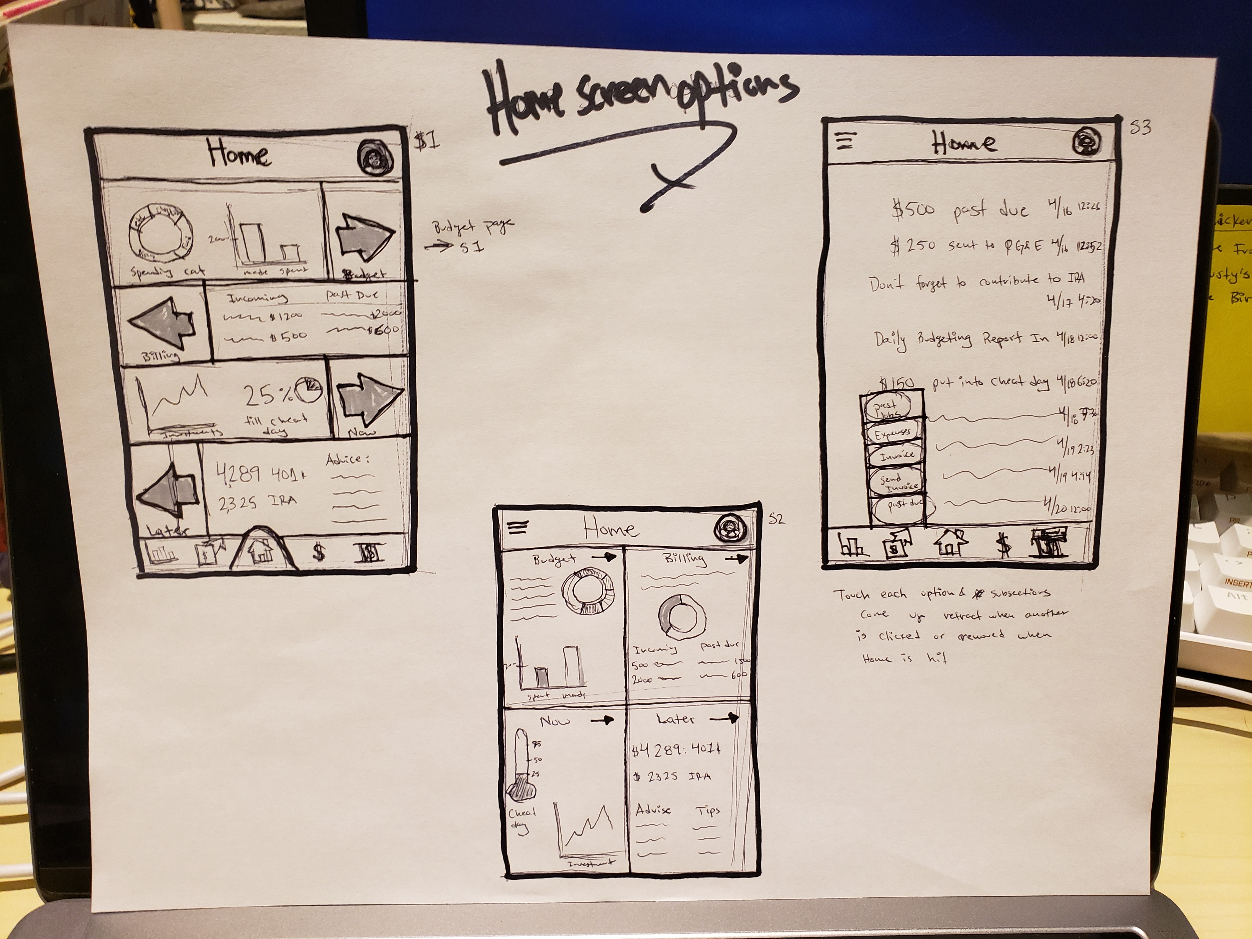
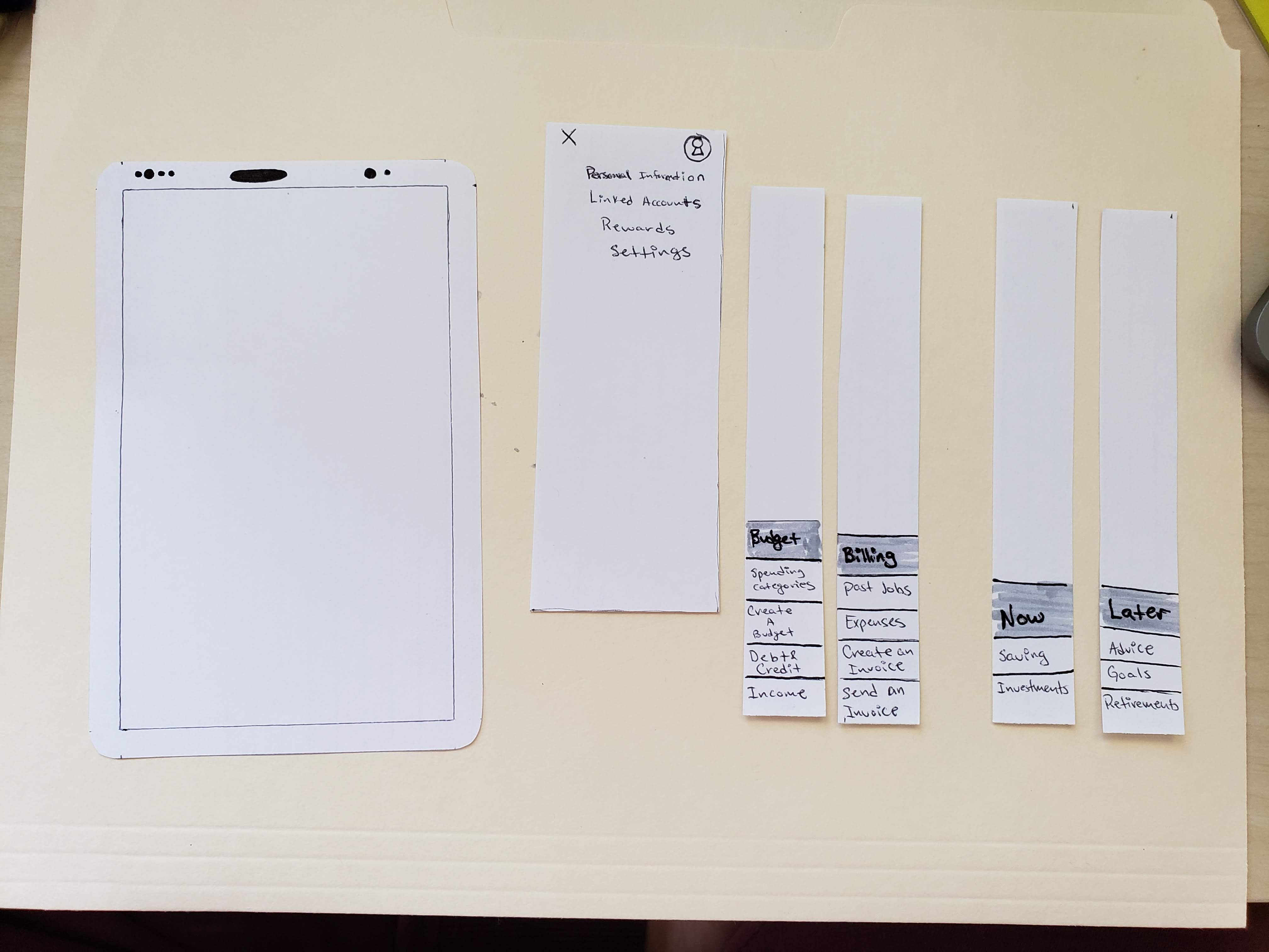
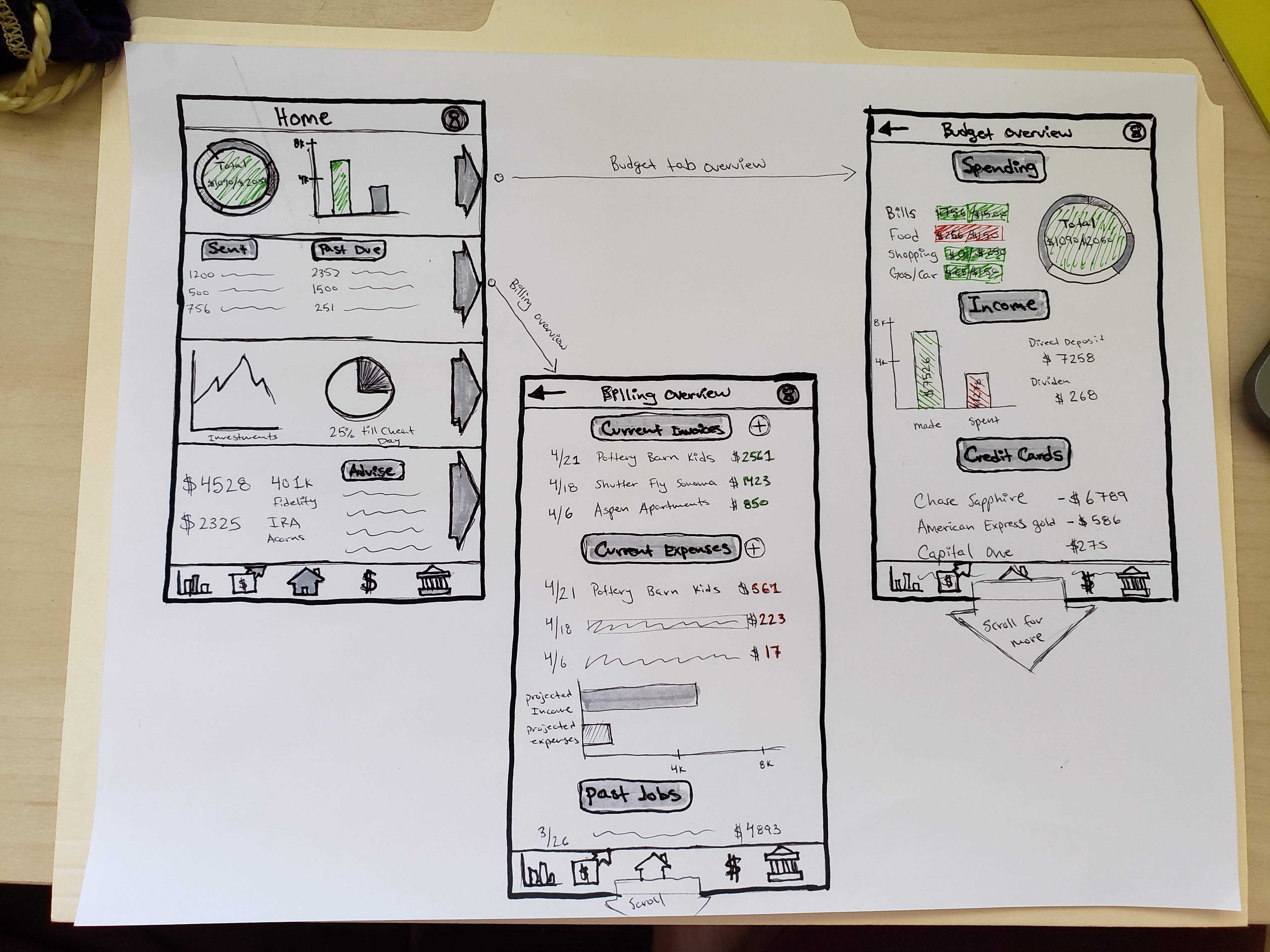
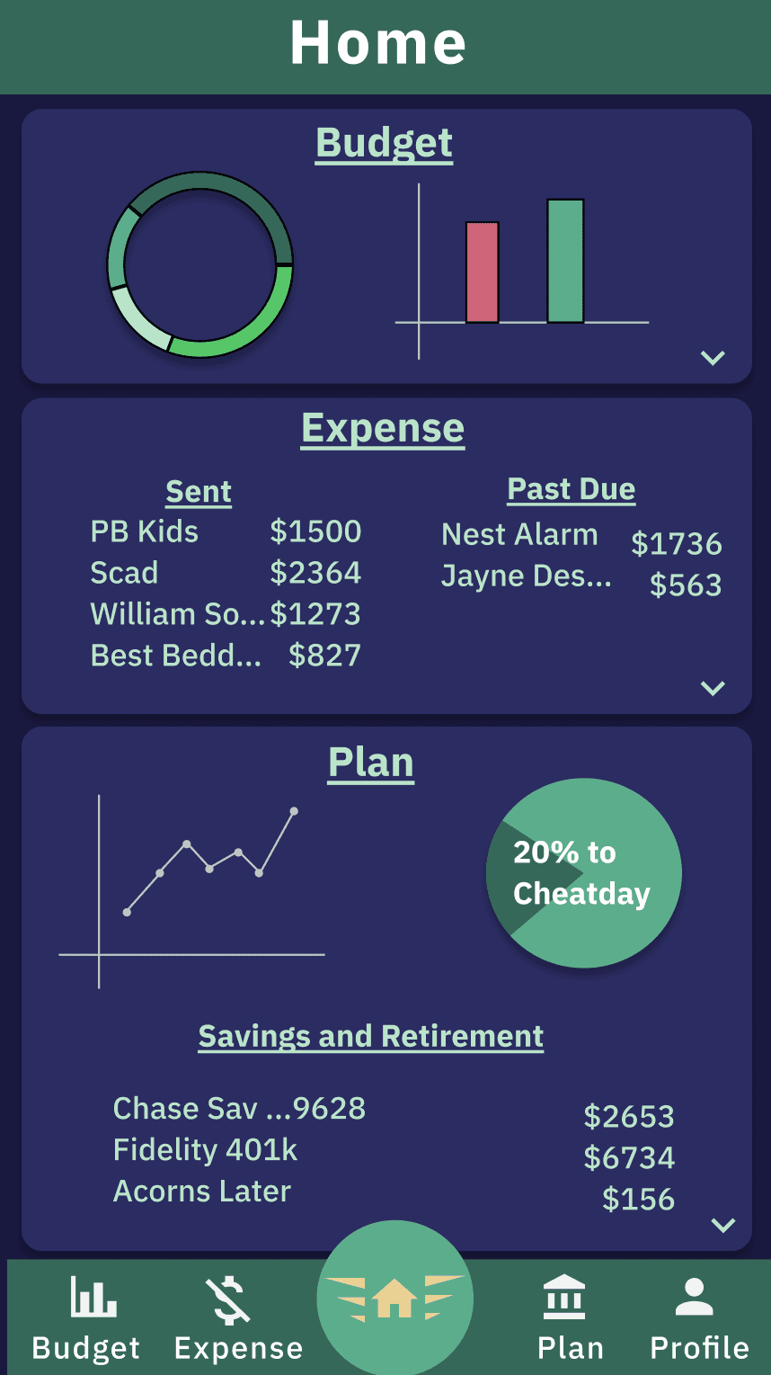
Early Discussions with users stated that we had two general ways information was consumed; Skimmers or those who looked over the information and skimmed graphs and divers those who are your more financially literate users who wanted to dig into numbers and charts. Both of these groups liked a visual representation while divers liked seeing more raw data. Thus a multi-layered approach was taken to showing information. With the home screen, we had the simple data, or quick glance information, for the skimmers and then all those graphs and cards would be clickable for more in-depth information.
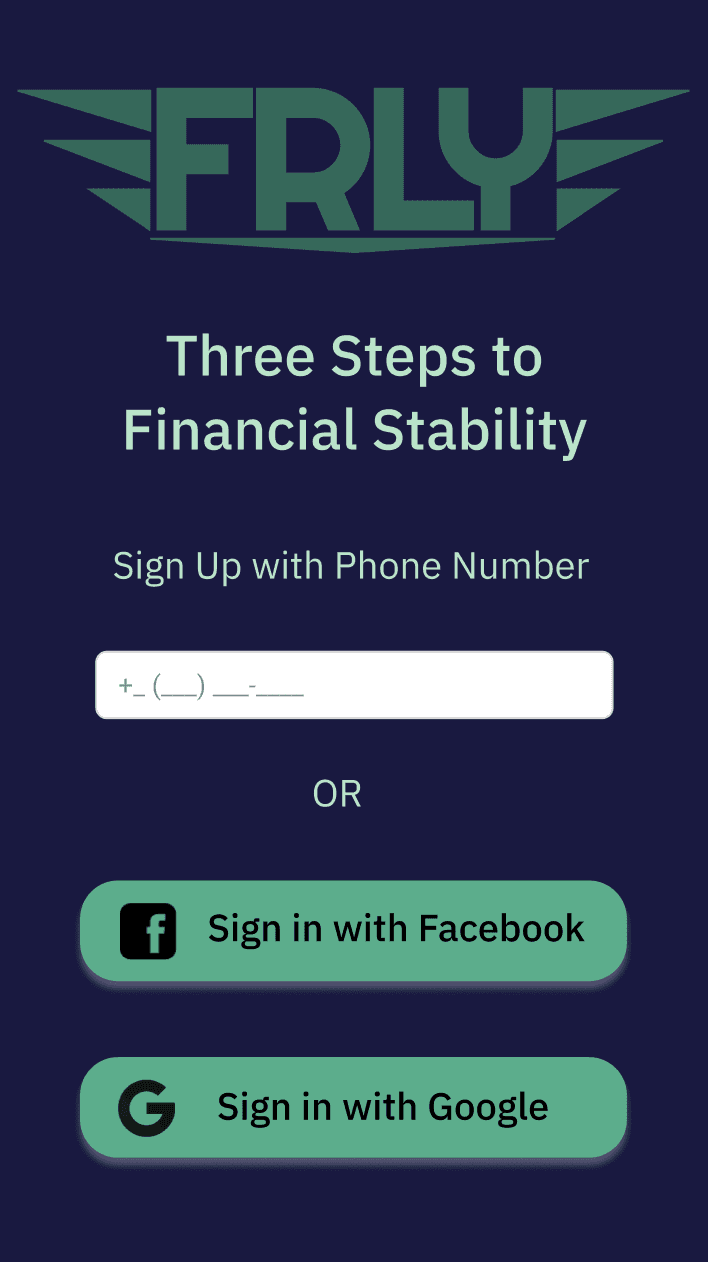
After running guerilla research outside of Peet’s in downtown San Francisco there were three major trends that popped up from their usage patterns. 1) Users always took the path of least resistance (logging in with Google or Facebook or utilizing connection finger or face I.D.) 2) Users were using each section as if they were cards and wanted expanded information, 3) Users were hesitant to link their financial accounts to the app right off the bat.
From the earlier questions, I gained three pretty positive insights into the direction of the first iteration.
Always make logging in easier whether it be Facebook, Google, or Face I.D.
The fewer steps for a completed app (landed on three) the better
By getting them to use the budgeting tab and expense tab first it will make them more likely to use the link an account by creating less work for them later and it will give them more trust in the overall app
The colors were kept basic on a psychological level (green good, red bad) while muted colors were chosen to be accessible on both light and dark themes (Passing the WCAG AA test). Dark grey was chosen for the dark theme in the second iteration since it makes the green pop while having a contrast ratio for the small text of 12:1 (Passing the WCAG AAA test).
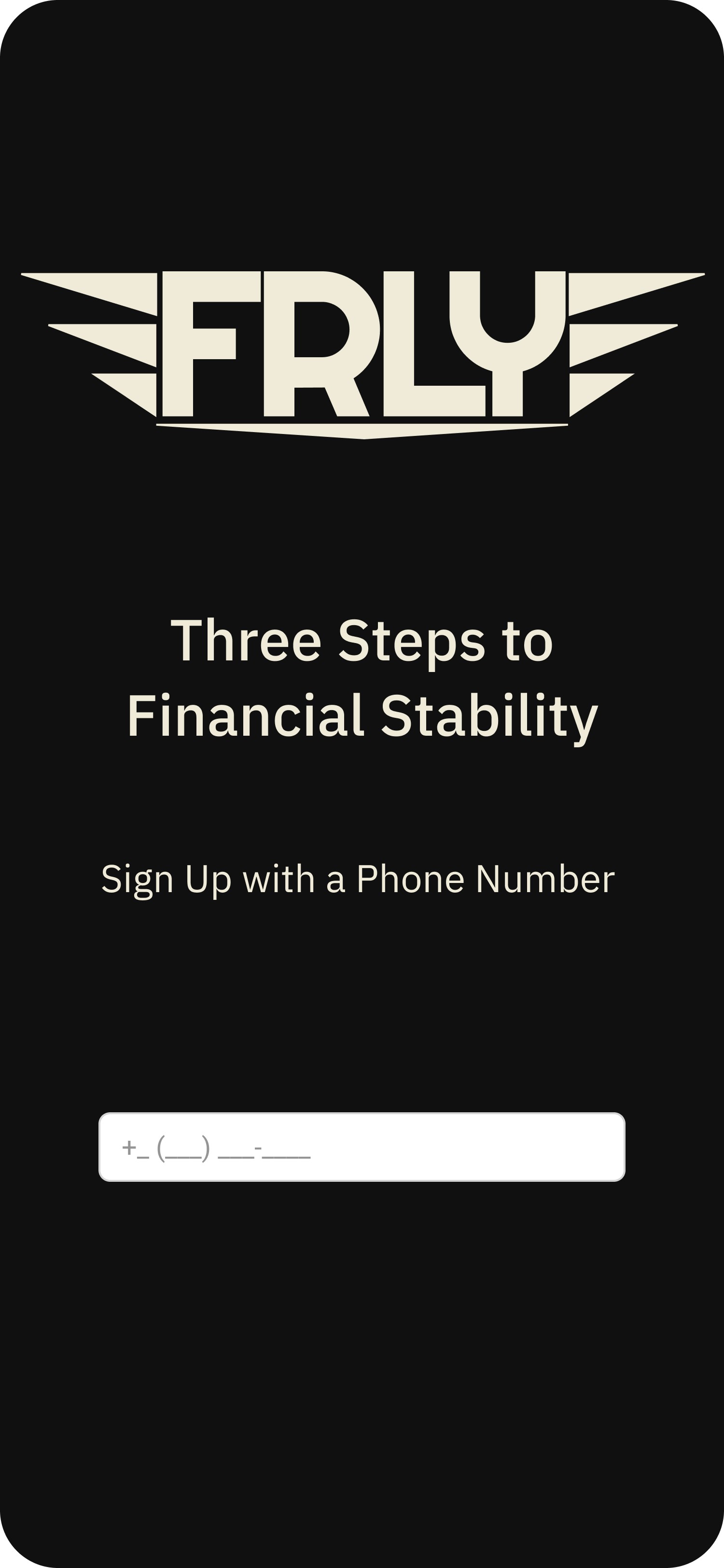
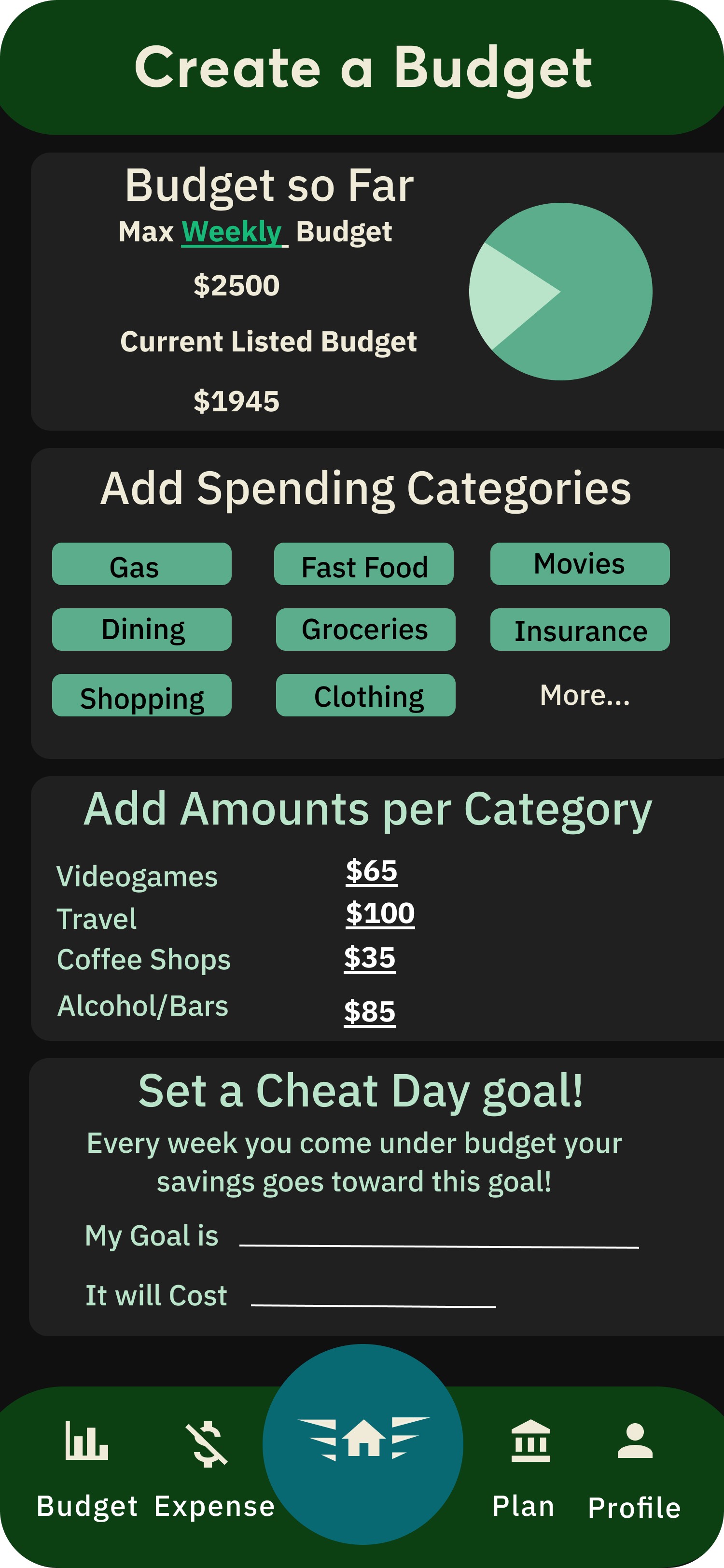
These two screens were highlighted because they are the most important. They had the most change between iterations and they were where we saw the most discussion from the guerilla research. First is the splash/onboarding screen (easy login) and second is the “Create a Budget” Screen (where the user is retained).
User Testing
After this second round of interviews and testing it was obvious that the Google and Facebook log in had to be scrapped due to 3 out of 5 interviewees saying they were uncomfortable with it (Post Cambridge Analytica). Due to the need for a strong level of trust to be built quickly with people, it was necessary to completely eliminate these two options from our login. The app and design cannot afford the hindrance of those two buttons especially with dealing with such sensitive information.
Next the Budget Screen was reordered from broadest (total amount) to most specific (categories). The changes also helped with the usability of this screen as well. With the greatest value expressed at the top (the user hopefully setting the max budget once) then categories and changing of values being changed and tapped more there was a need to have those in a more accessible location for the user.
“Isn’t there another way to log in without them [Facebook and Google] being there?”
— Participant 1
“What does cheat day do? Is it like a workout cheat day?”
— Participant 2
Iteration 2
From follow up interviews of iteration 2 we were able to discern that the viability of the product increased based on the number of users saying they would ‘use the product frequently’ in the System Usability Survey. The average SUS scores rose 14.5 points giving FRLY a strong A. Some of the most positive feedback was based around the upcoming bills tabs, cheat day, and the overview tabs.
There is still confusion linked to the expensing tab by most non-freelance users but my more financially literate user liked they could scan and track expenses later for tax purposes.
“It is nice to see the numbers that correlate to the graphs on the home screen.”
— Participant 2
"With all my bills being automated it’s nice to see when they are being taken out”
— Participant 4
Next Steps and What I Learned
Next Steps
Expand the expense section by redesigning how the information is displayed to reduce confusion for non-freelancersCreate an invoice option in the app to make the expense section have higher functionalityFlesh out the advice section to help our users get the most out of our expertiseinclude categories, sorting, and/or search Look into security and ways to display that to the user to instill more trust to be as transparent with our users as possible
The Good, the Alright, and the Learned
This project really helped develop many key aspects of myself as a designer. Creating FRLY allowed me to utilize a lot of techniques and by doing so I was able to increase my ability to ruthlessly cut my ideas, synthesize multiple lines of thinking, and lastly improve my interview skills.
To start when I had first dreamed of this project I had a scope that was far-stretching and wanted every element to go into as much depth as possible. The needs of my users, my stakeholders, and general feasibility I think that a lot of ideas were sidelined or just dismissed but for the better. I think by really honing in on the true needs of the user I was able to reduce the most basic pain points out and fulfill their needs.
Secondly, was to synthesize my data not just once but at each step of the process. To look not just at the previous interviews but the data from the surveys, secondary research, and informal interviews to extract more meaning as the process developed.
Lastly, in raw numbers, my interview lengths increased by about 30 percent. My nervousness had drained away and the information I was getting was deeper than “I like this” or just all-around silence. My ability to make users expand upon what they were looking at and I really started to make interviewees open up, especially during the think-out-loud portion of my interviews.You made it to the bottom! Thanks for sticking around and if you have any insights or comments please don't hesitate to reach out to me.
