UX/UI Designer

5 Months Part Time Consultant

Solo Designer
Overview
My Role
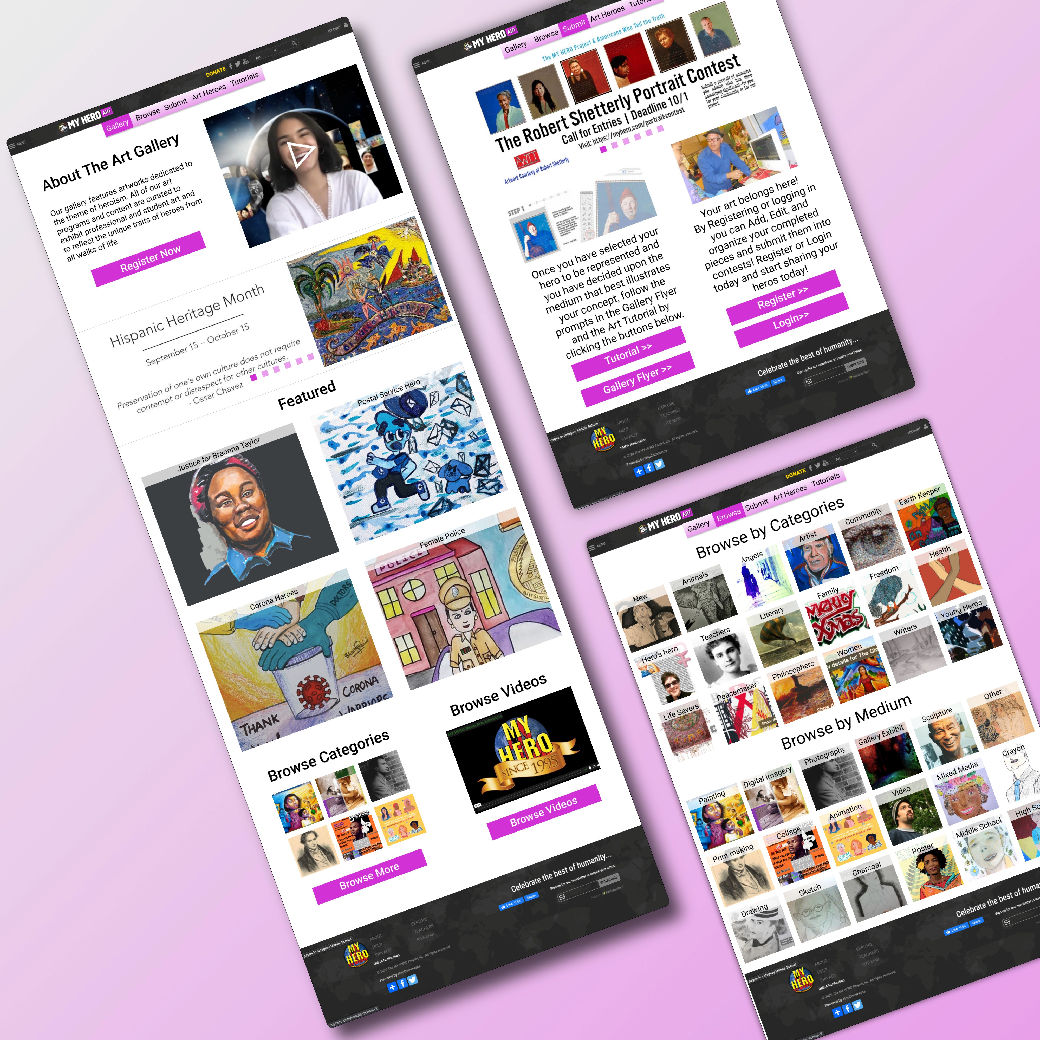
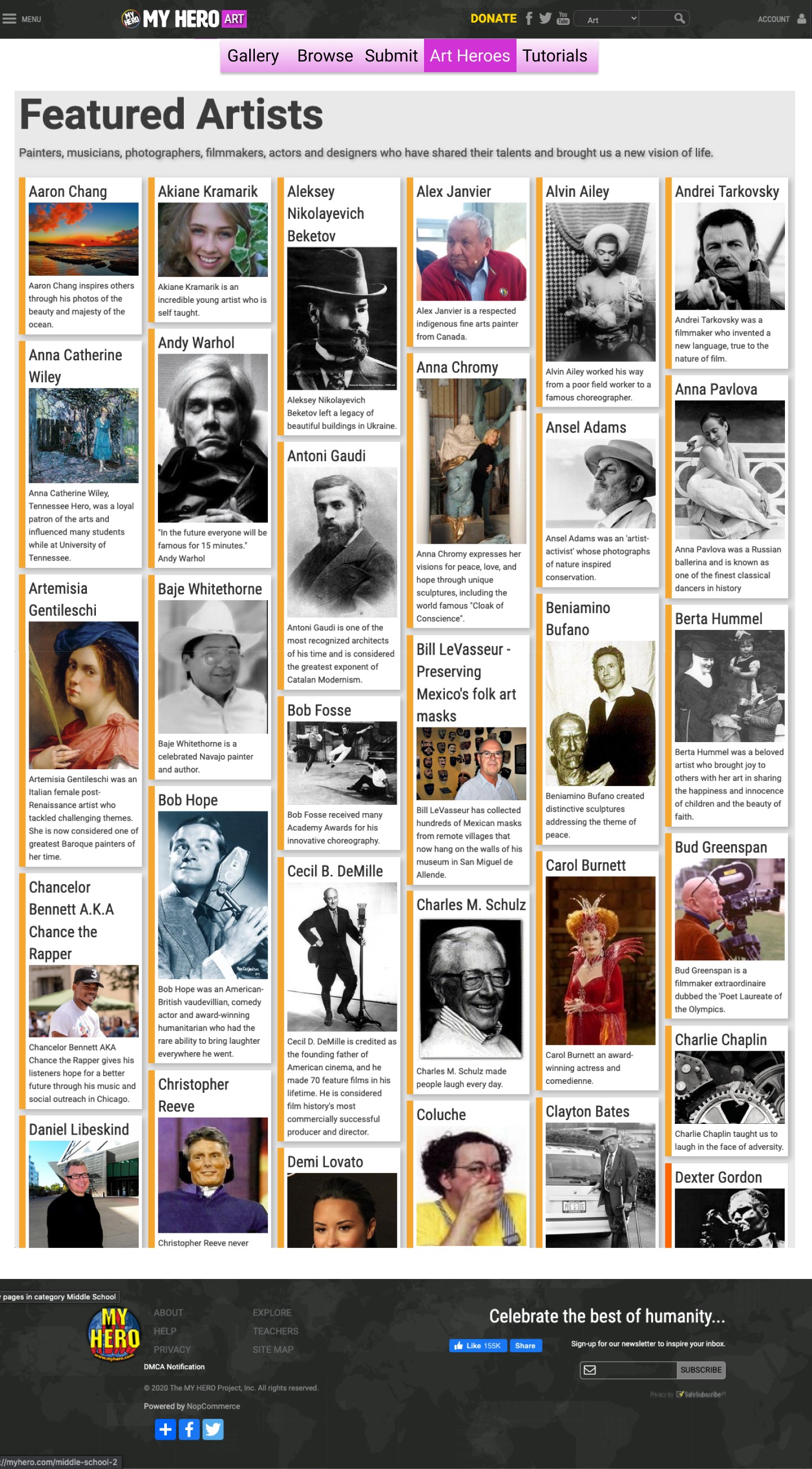
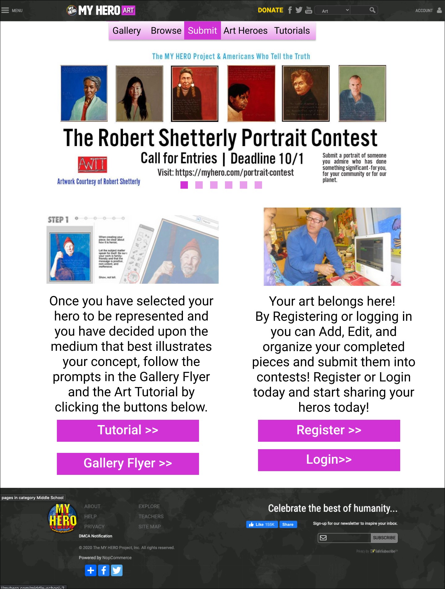
The current, and only screen, of MyHero/art is not meeting the needs of the user or helping them engage with the site. The banner system at the top is huge, the side bar in order to submit is confusing, the featured art is extremely long with an obscene amount of white space, and the call to actions are lacking (or in some cases broken links). My direct supervisor and I also wanted to develop the pages in order to allow easier access to the art and the ‘create system’ (the process to submitting art to myhero). To keep it consistent with the rest of the site we wanted to create a spoke system flowing from the home page. That way there was more than 1 access path to each page as well as easy flow back to the home portion of the /art page.
Iteration 1
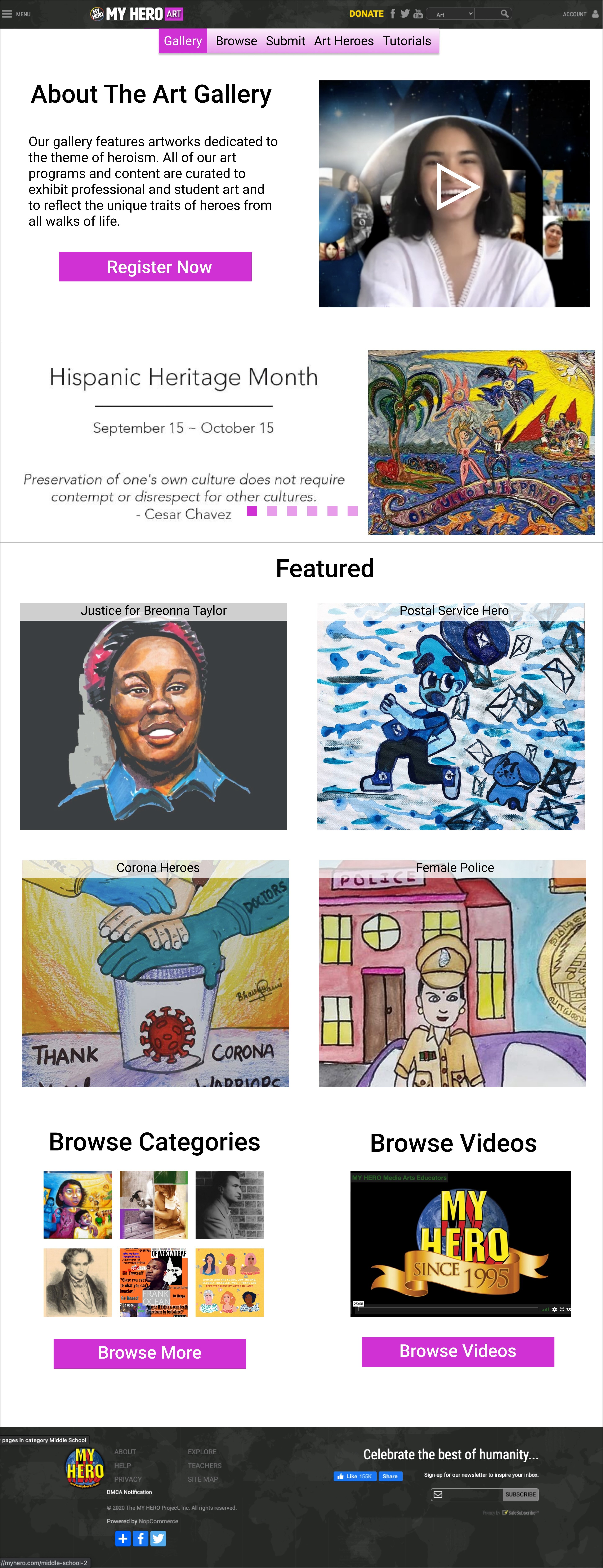
The first challenge I went and tackled was reducing the banner system by 50% and putting it below the About section on the gallery home page. By doing this I freed up a large portion of the page and actually had an easily visible section that explained the purpose of the art page as a whole. One of the current issues is that new users tend to bounce right off the current page in about 15 seconds.
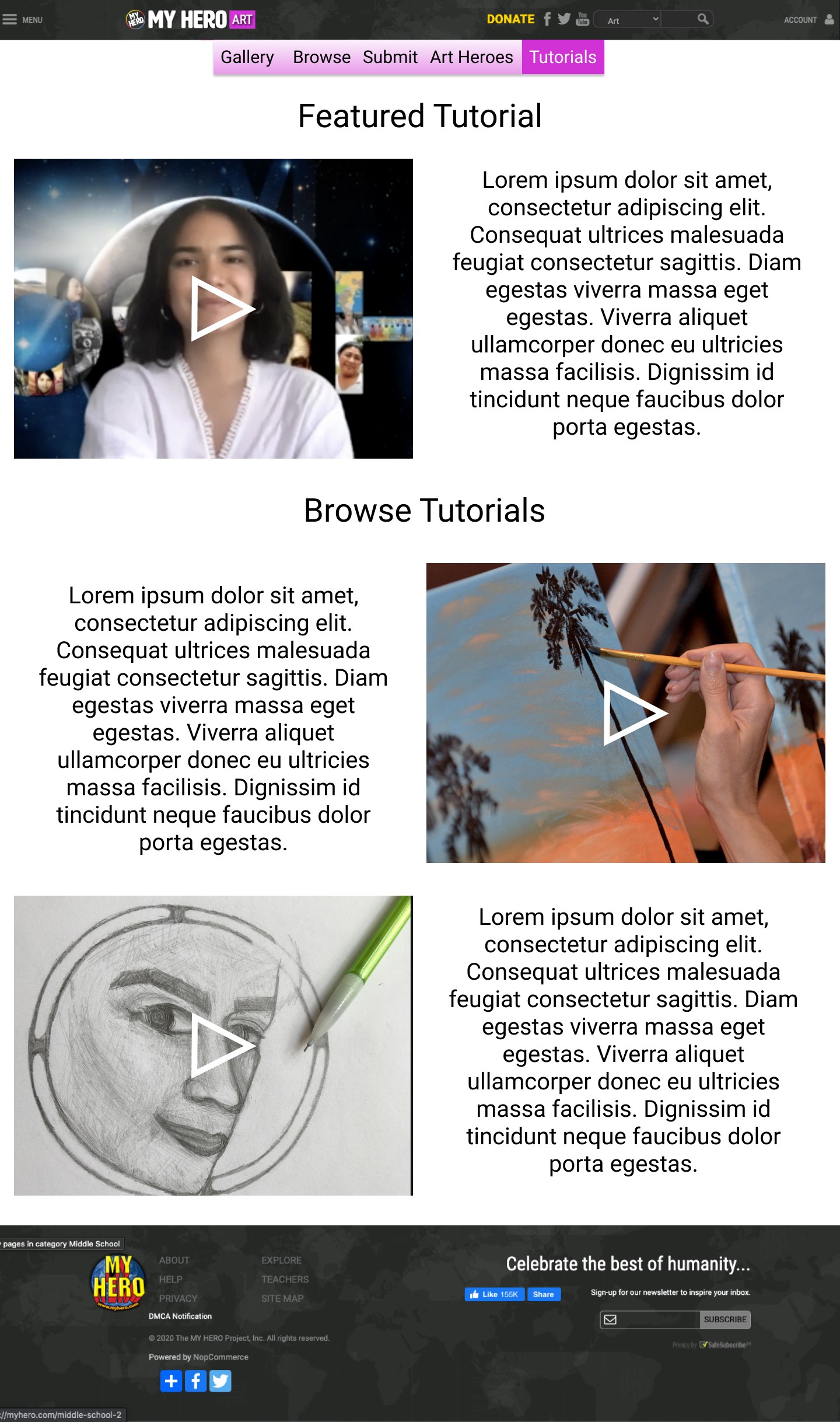
We decided to create a navigation bar at the top as our main point of accessing the other parts of the /art pages with a later call to action to get people to explore the categorized galleries. As a tool for educators, we wanted to make it easier for them to access this section and find the exact art they are looking for.
The next challenge I decided to tackle was adding a call to action. After multiple calls with stakeholders, I learned that what they wish for their current users is for them to add art (particularly professionals), browse art, and lastly participate in their competitions. After viewing their current site I noticed that the home page for /art didn’t have a single call to action that was driving their specified main goals of this site. The register button in place is the same button currently used that allows you to submit once you have registered. In order to generate more worth for professional artists they wanted to have the featured section be larger and more prominent than it currently is.
Much of my design constants and decisions are based on an extremely small development team and the fact the site is built and being developed on the Microsoft.NET framework. This means that the iteration process can be lengthy and the intractability of the overall site is minimal. Many of my design choices are simple because I am using this small project as an example piece of how you can drive engagement with small tweaks across the site. Also in consideration for much of my design decisions was to update but keep it consistent with current parts of the site as a whole (/film, /stories, /teachers lounge, etc).
Compare
Next Steps
Once this current iteration of /art is launched I am going to lead a concerted effort to really get the current team leads to focus on user research. This means engaging with the current users and starting to actually utilize google analytics. I am hoping to get them to also purchase Hotjar so we can have live examples of usability issues.
There are also a host of usability issues in the create program (which is linked to /art) that I wish to also tackle. I am hoping that the success of this current design iteration will give me more power and a larger voice to really start driving changes. I am hoping to remove a lot of “features” from the current site that tend to confuse and overwhelm potential new users.
I am currently designing a design system for them so that when they start rolling out the design changes on their site there is a formalized and approved collection of assets for them to utilize for rapid testing and high fidelity designs.
